Yelp
Yelp is a platform that helps users discover, review, and connect with local businesses like restaurants, shops, and services.
01
Problem Statement:
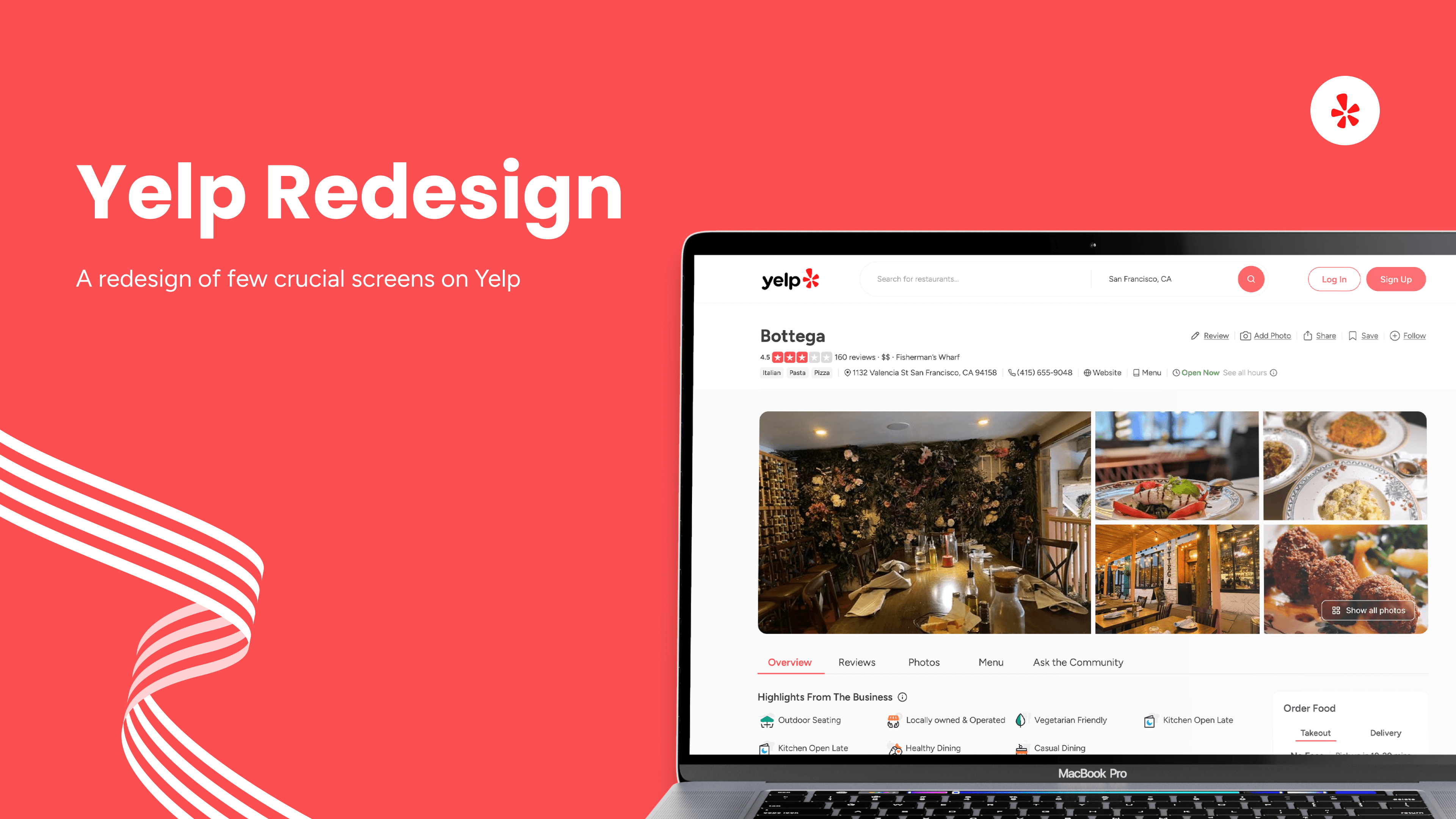
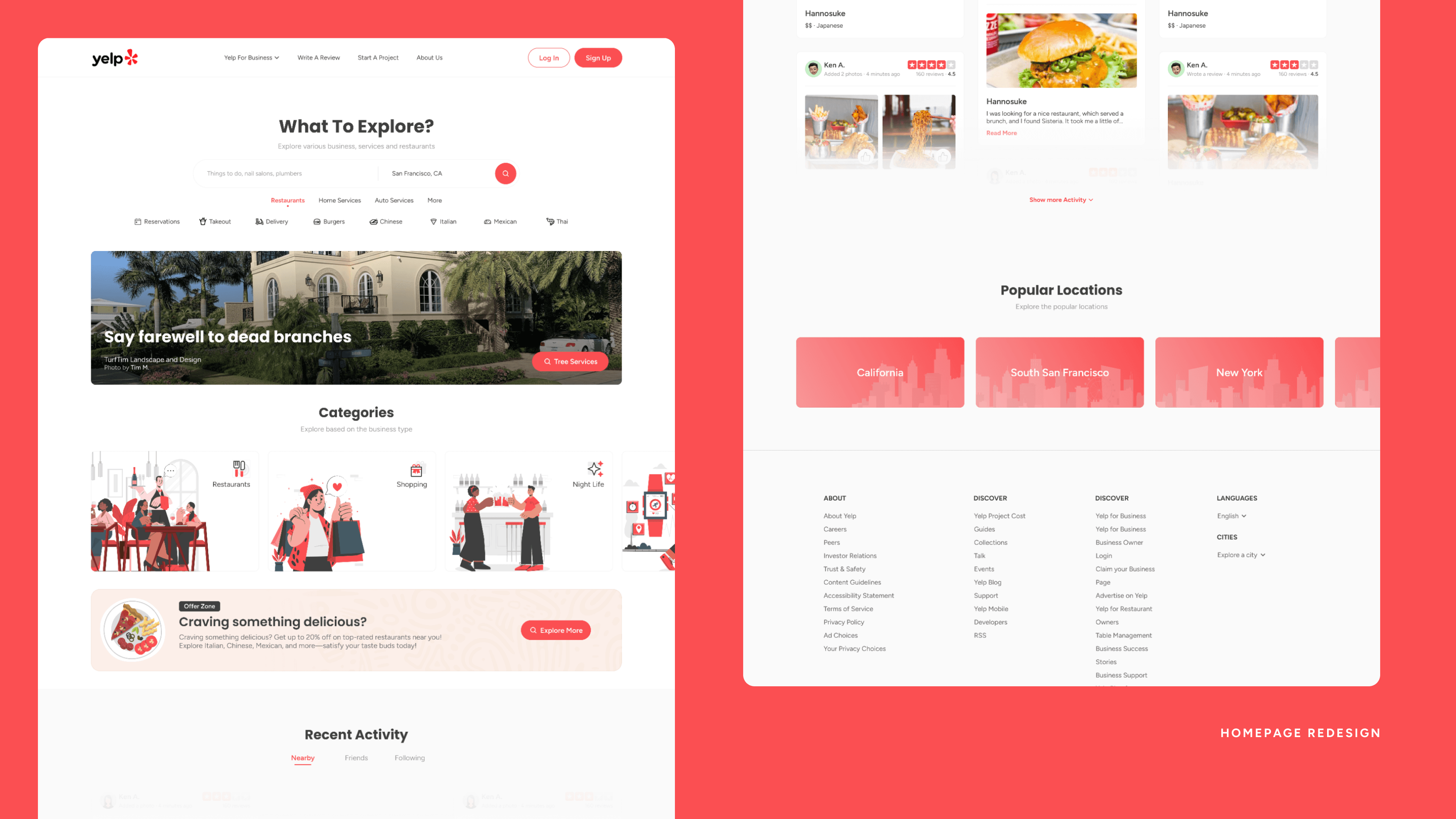
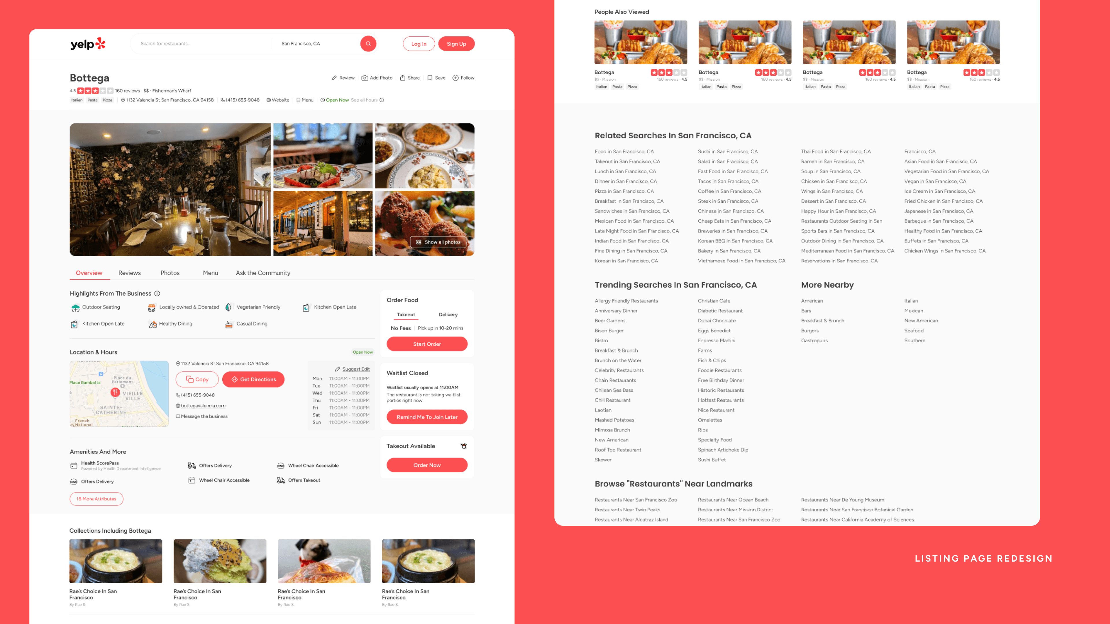
Yelp’s homepage, search results page, and individual listing page suffer from cluttered layouts, inconsistent design, and overwhelming information. Users struggle to quickly find relevant businesses, navigate filters, and engage with key actions like reviews or bookings. This leads to a frustrating experience, especially for those seeking fast, informed decisions. The goal is to redesign all three pages to improve usability, visual clarity, and overall user flow for a smoother experience.
02
Solution:
The solution is to streamline the layouts of the homepage, search results, and individual listing pages by improving visual hierarchy, simplifying navigation, and optimizing filters. This includes using a clean card-based design, clearer action buttons, and consistent spacing to reduce clutter. Enhancing map integration, highlighting key information like reviews, and adding quick-action features will make it easier for users to find and interact with relevant businesses efficiently.
03
Initial Evaluation:
The initial evaluation of Yelp covers three key pages: the homepage, search page, and individual listing page. The homepage features a search bar, business categories, and user-generated content, catering to people looking for local businesses and services. The search page includes filters, ratings, and a map view, helping users find businesses based on specific criteria. Lastly, the individual listing page provides detailed business information, reviews, photos, and booking options, allowing users to make informed decisions before visiting.
04
User Experience (UX) Analysis:
The homepage features an improved navigation bar, a centered search bar for easier access, and a business quick links section with a unique hover state. A highlights banner and horizontal slider for business categories enhance visual appeal. However, the review section feels cluttered, and mobile optimization is needed. The search page benefits from cleaner filters, revamped listing cards, and improved FAQ and footer sections, though filters could be more usable and colors refined. The individual listing page offers a better layout with selection tabs, organized business details, and enhanced CTA buttons, but still lacks mobile optimization.